

RUFFLEBUTTS
RuffleButts is a bold, playful brand, so I wanted the digital presence to feel just as energetic. In this concept refresh, I redesigned the Instagram grid and extended the same visual style into email campaigns using bright brand tones, dynamic hand-drawn accents, and product-forward layouts. The result is a cohesive, scroll-stopping direction that feels fun, polished, and easy to shop.
all about RUFFLEBUTTS
-
RuffleButts is a children’s apparel brand specializing in playful styles for babies and kids. I worked as a Graphic Designer and Content Creator, designing branded marketing assets and creating content for social media and email campaigns.
-
Tools: Canva, Photoshop, Procreate, Edits, Illustrator
Deliverables: branded imagery, Ad design, e-mail marketing, campaign design, photoshoot management, social media management -
The goal was to strengthen RuffleButts’ brand consistency by developing a scroll-stopping Instagram grid and matching email style that blends polished product imagery with playful hand-drawn elements and dynamic layout design.
-
The strategy behind this refresh was to create a more cohesive and recognizable digital presence for RuffleButts while keeping the brand’s playful personality front and center. I focused on building a consistent visual system that could translate across both Instagram and email, using a balanced mix of photoshoot imagery and UGC-inspired content to keep the brand feeling both polished and relatable.
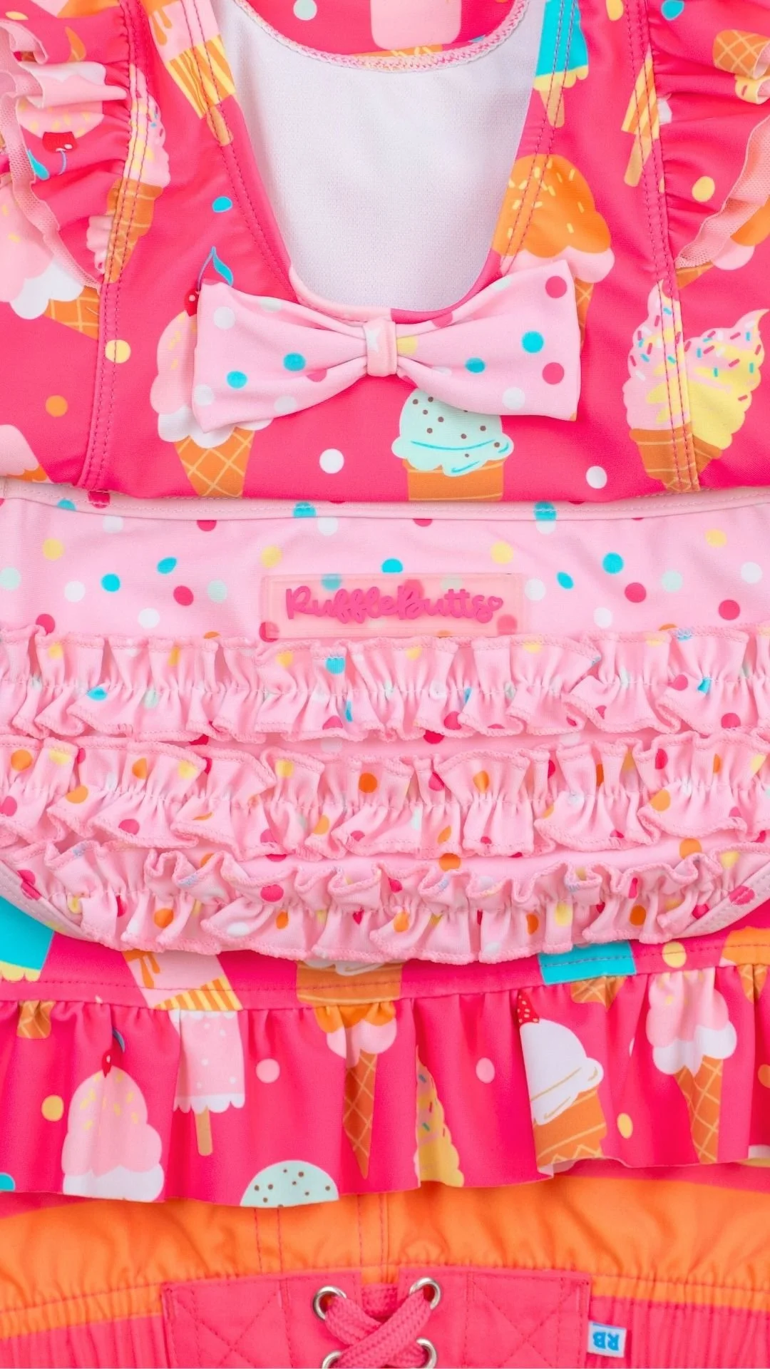
The creative direction leaned into bright brand tones, dynamic hand-drawn elements, and layered flat lays to add movement and visual interest throughout the grid. The final result is a fun, branded, and scroll-stopping look that feels more intentional, energetic, and true to the RuffleButts identity.
-
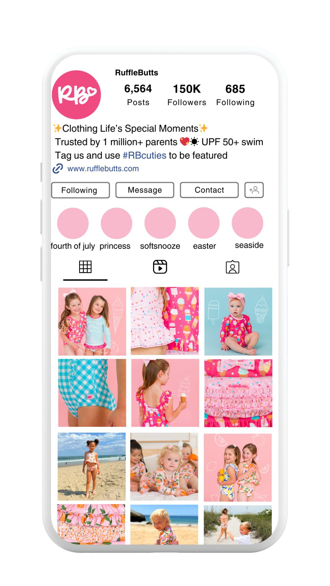
A brighter, more cohesive grid with stronger visual consistency
Improved brand recognition through repeatable hand-drawn design elements
A more engaging content rhythm that feels intentional from a profile view
More dynamic product storytelling through layered flat lays and styled layouts
Stronger cross-platform consistency by extending the same look into email campaigns
from THIS…
…TO this
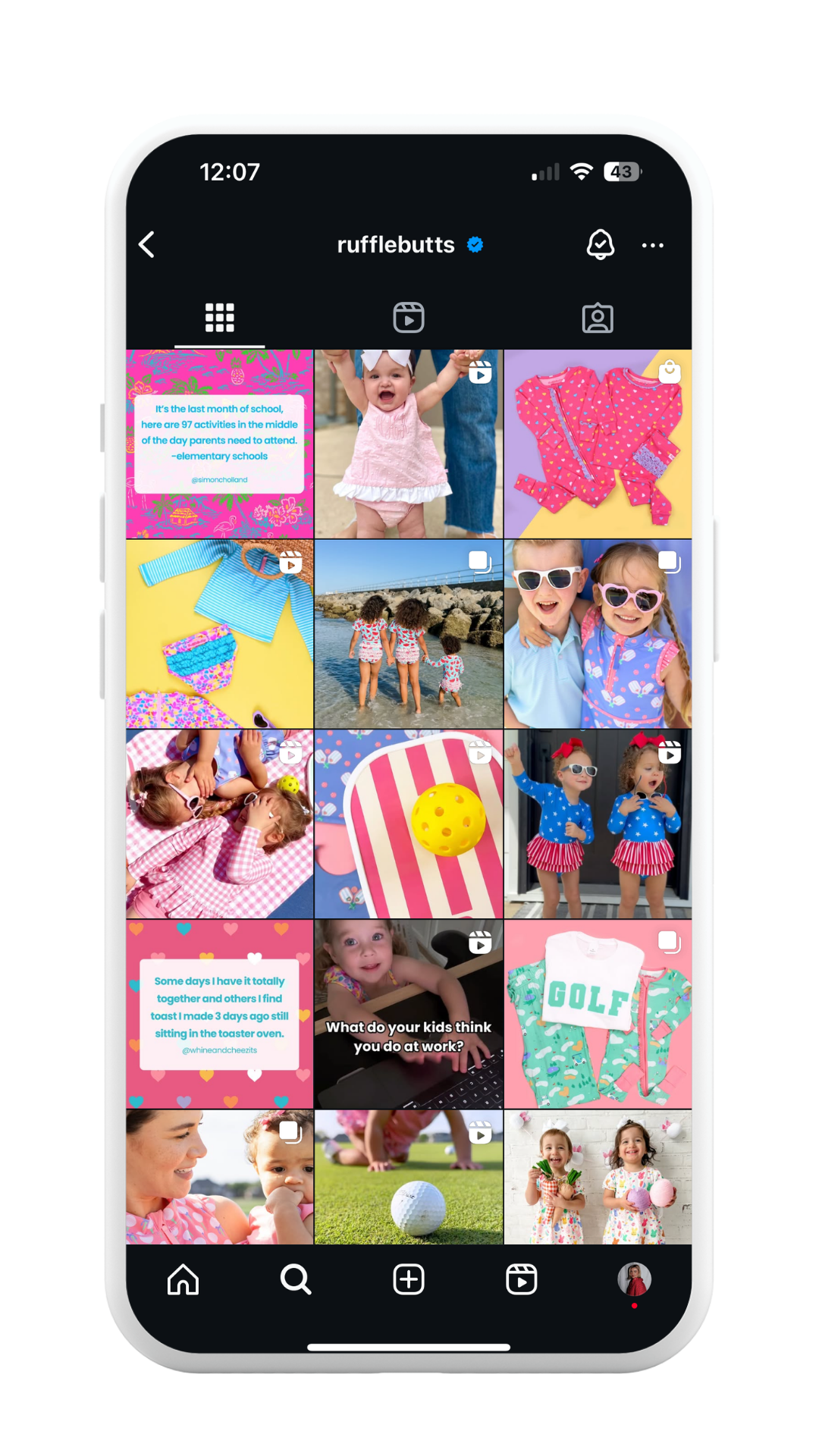
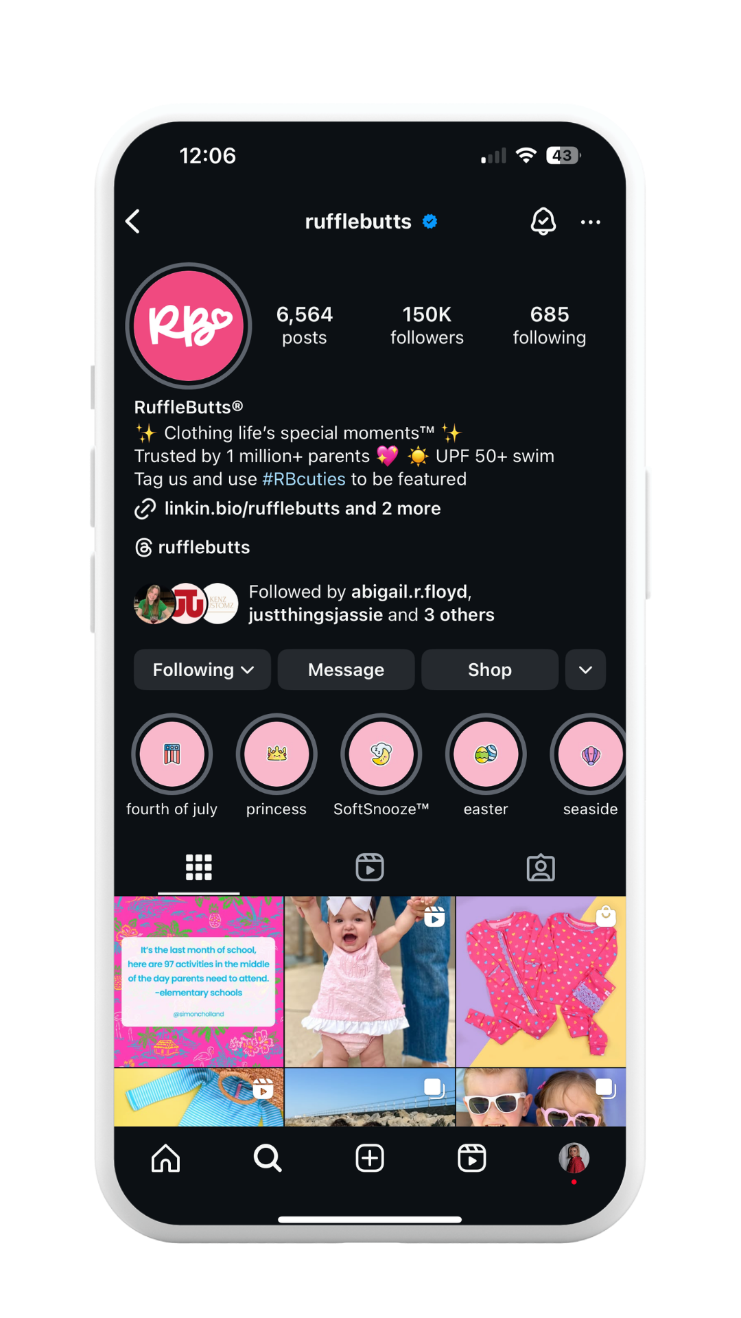
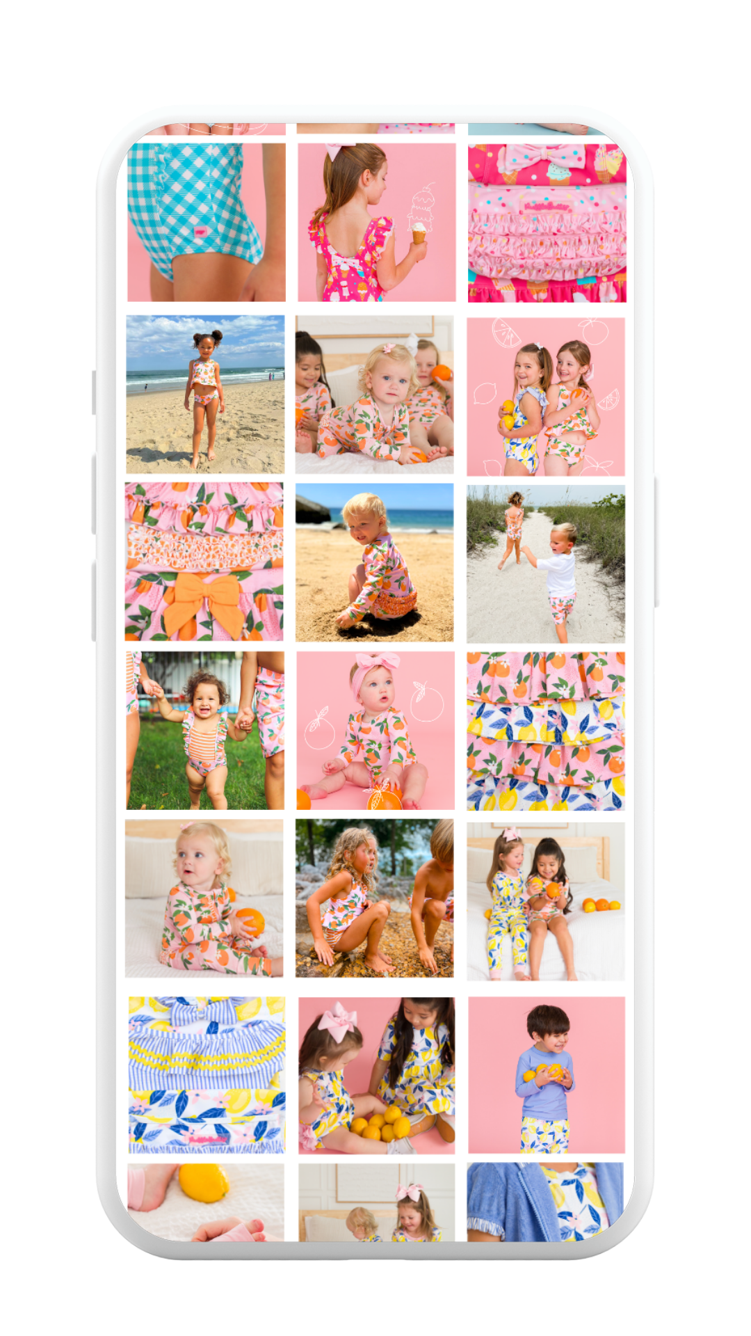
When I began this refresh, the RuffleButts feed felt darker and visually scattered, so the brand’s playful personality was not coming through as strongly as it could. The grid included a mix of product shots, lifestyle imagery, and graphic posts, but there was not a consistent visual direction tying everything together.
Issue: from a profile view, the overall impression lacked rhythm and cohesion, which can make it harder for new visitors to quickly understand the brand and feel drawn in.
My goal with the redesign was to create a feed that felt instantly recognizable, bright, and fun while still keeping the product as the hero. I started by thinking about what parents should feel when they land on the page: joyful, confident, and excited about the clothing. From there, I built a simple visual system to guide the grid. I leaned into lighter, more vibrant brand tones, especially soft pinks and playful pastels, to lift the overall mood of the feed and create a more consistent look across posts.
To reinforce the brand’s charm, I introduced hand drawn accents and playful objects as a recurring detail throughout the grid. These elements were designed to feel light and supportive rather than overwhelming, so the photography still leads while the illustrations add personality and help unify the feed. I also focused on strengthening the content mix by balancing polished photoshoot imagery with UGC inspired moments. This keeps the feed elevated and aspirational while still feeling relatable and community driven, which is especially important for a family focused brand.
Finally, to add more depth and visual interest, I incorporated styled flat lays and layered product compositions. Instead of relying on straightforward product shots alone, the stacked arrangements create texture and movement that make the grid more engaging to scroll through.
The outcome is a cohesive, bright, and playful feed concept that feels more intentional and on brand, with a stronger first impression and a clearer visual identity that supports both engagement and shopping behavior.
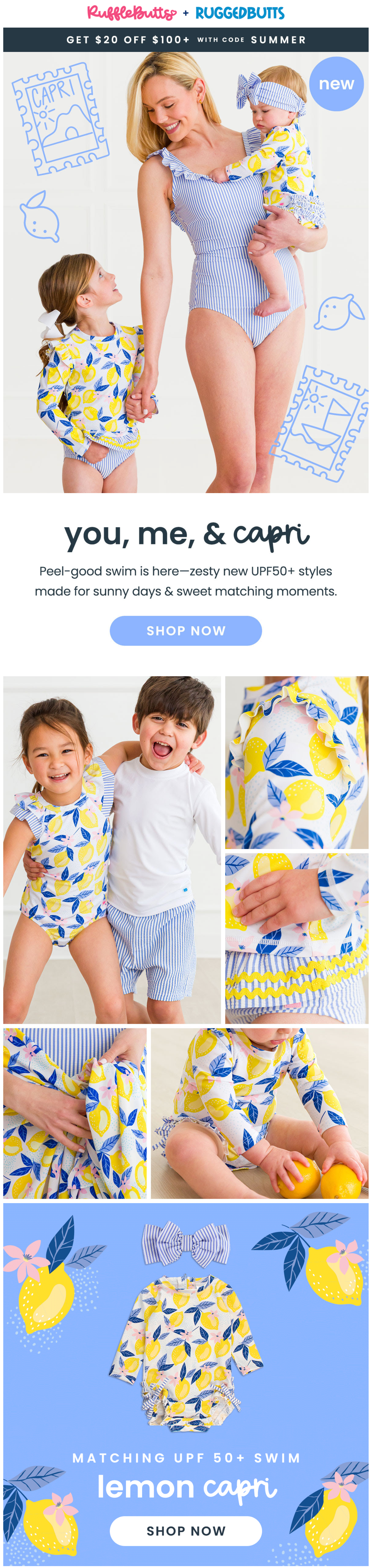
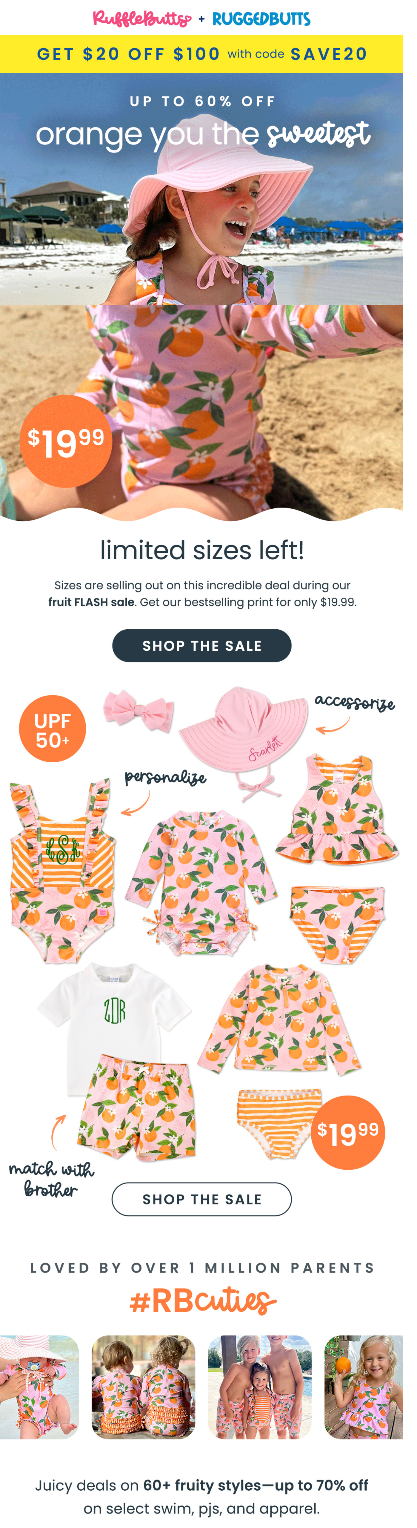
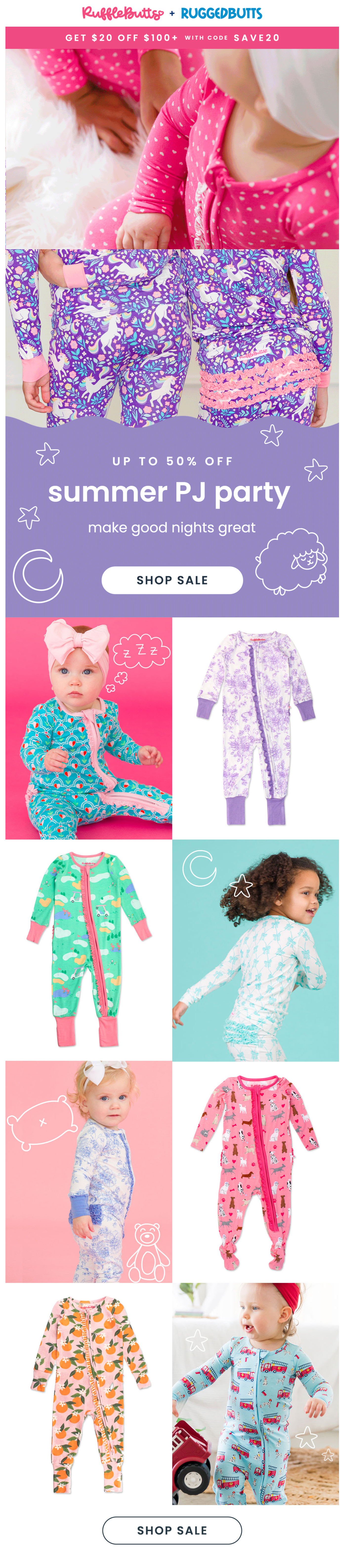
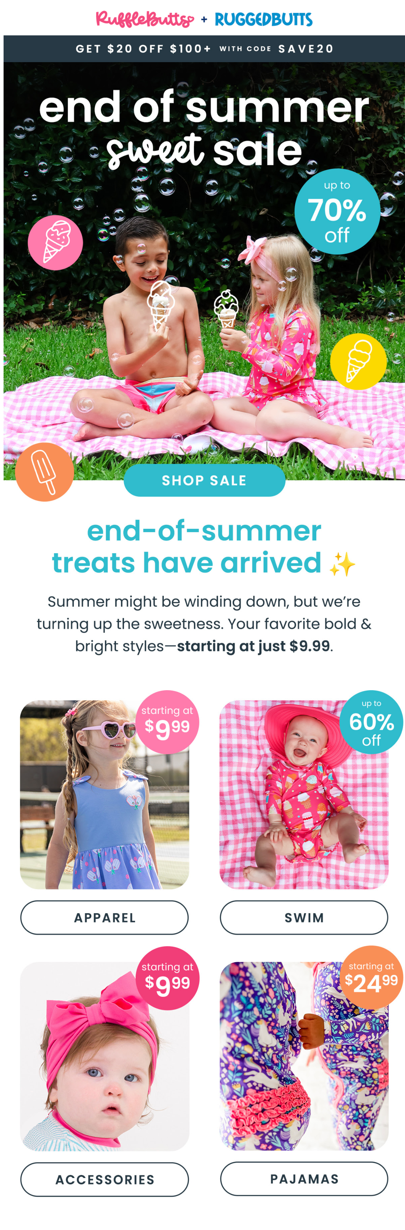
email campaigns
fun, playful, on brand throughline
For email campaigns, I carried the same playful visual direction from the social grid into a more structured layout. I designed emails that feel bright, branded, and easy to shop, using dynamic hand-drawn elements to add personality while keeping the product and messaging clear. The result is a cohesive email style that supports both engagement and conversion while staying true to the RuffleButts tone.
This concept was all about making RuffleButts feel as fun as it looks. By combining bright brand color, playful drawn elements, and a more intentional content flow, the result is a cohesive digital presence that feels fresh, engaging, and unmistakably RuffleButts