
blush & bloom
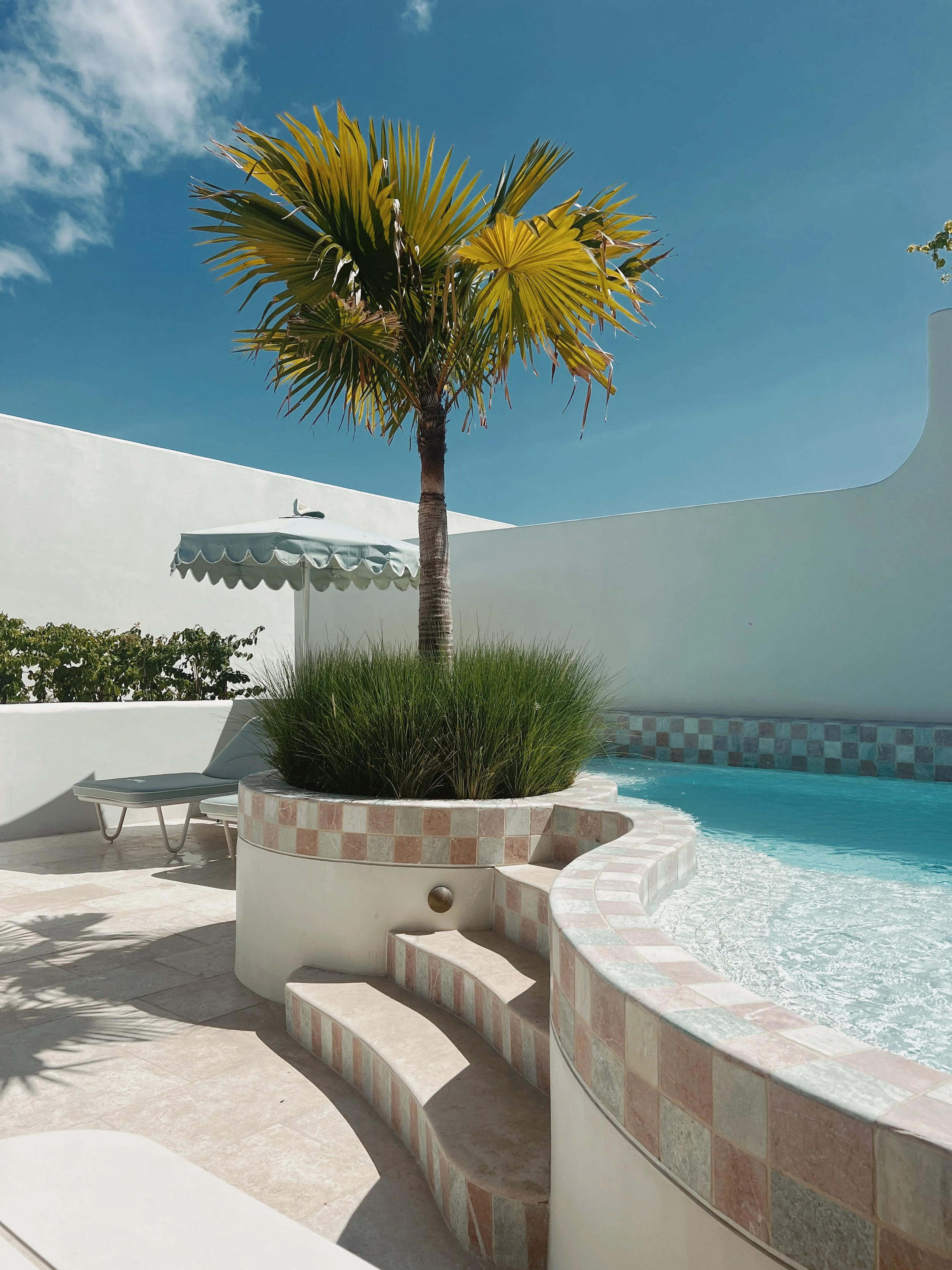
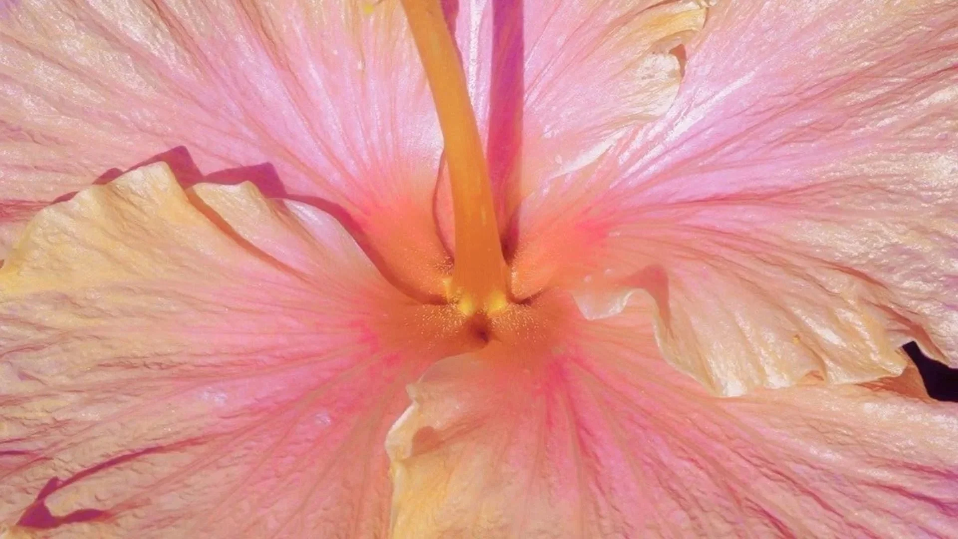
This brand concept for Blush & Bloom was designed to feel like a warm, stylish exhale
equal parts modern salon and sun-drenched escape. The imagery channels that post-appointment glow: relaxed, confident, and effortlessly elevated.
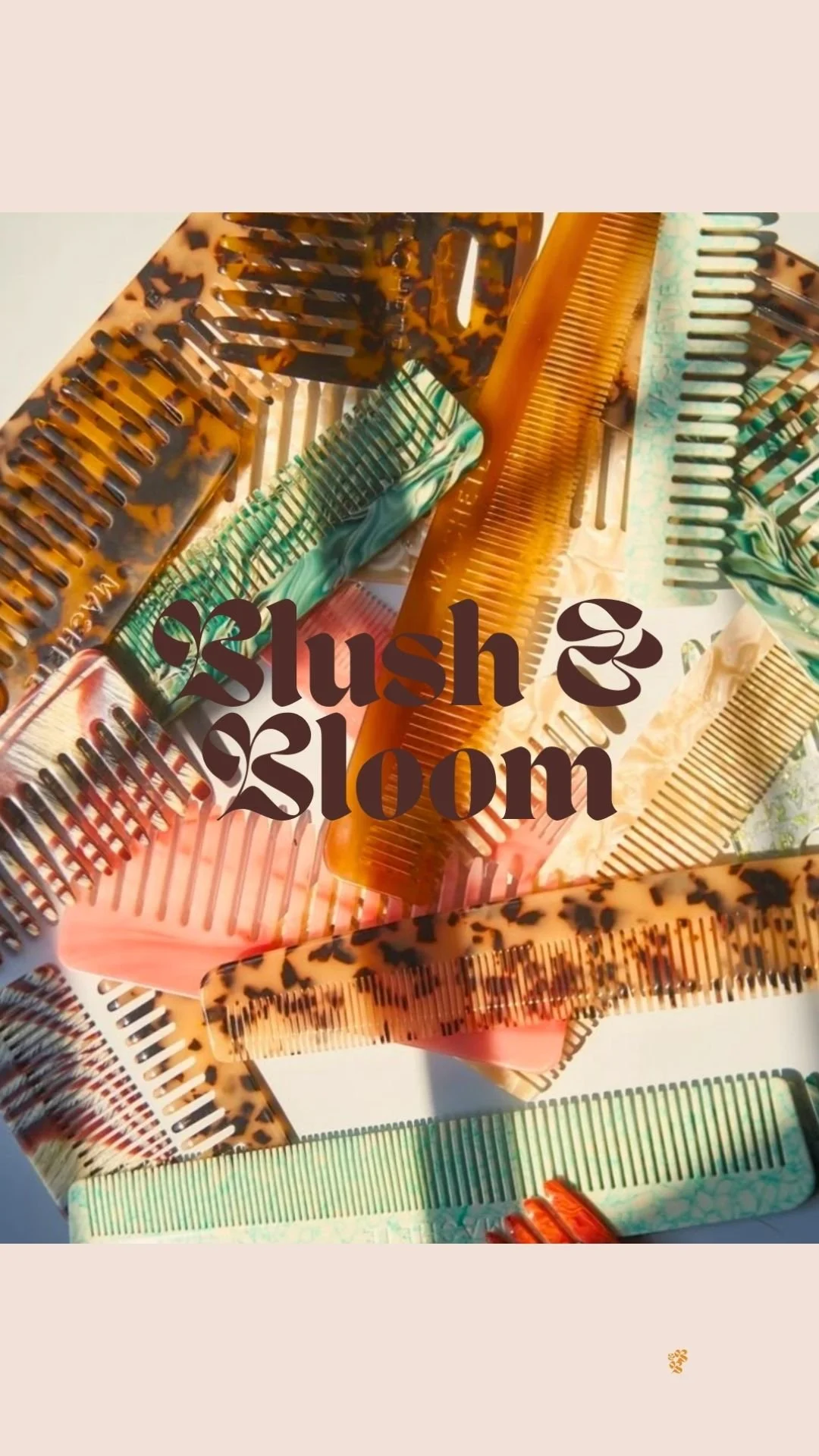
all about blush & bloom
-
Blush & Bloom is a conceptual salon brand created for a portfolio case study. The project included a full brand identity and a mock social media presence for a modern, trend-savvy hair salon. The goal was to build a digital and visual world that felt warm, editorial, and full of personality — a brand that lives at the intersection of self-care and self-expression.
-
Design Tools: Adobe Illustrator, Photoshop, Canva
Deliverables:
Logo system
Visual identity (color palette, typography, patterns)
Instagram grid design (posts, highlight icons)
Mock social media strategy
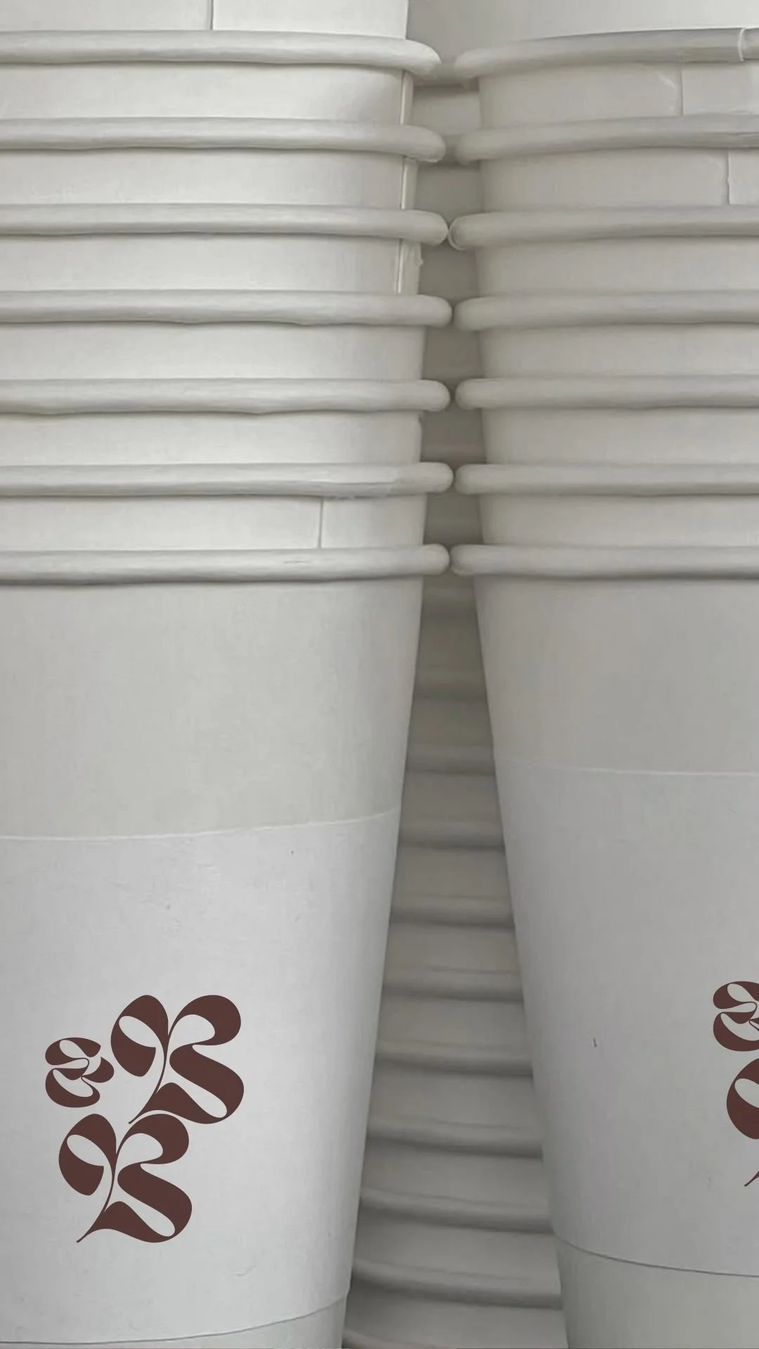
Branded merchandise mockups (coffee cups, salon imagery)
Creative direction for photography styling
-
The aim was to craft a salon brand that felt elevated but not intimidating — something that made clients feel like they were walking into their cool best friend's dream salon. I wanted to capture the glow-up energy that comes with a great haircut or color, while also making the brand feel social-media ready, shareable, and visually rich. It had to feel fun, feminine, and just the right amount of cheeky.
-
Blush & Bloom is built on the idea that beauty should feel like an experience, not a chore. The strategy was rooted in three pillars:
Soft Power: Through rich, floral-inspired branding and warm tones, the brand invites clients to feel pampered and powerful.
Personality-Driven: Typography choices (a bold, romantic serif) and playful messaging help the salon feel stylish but approachable.
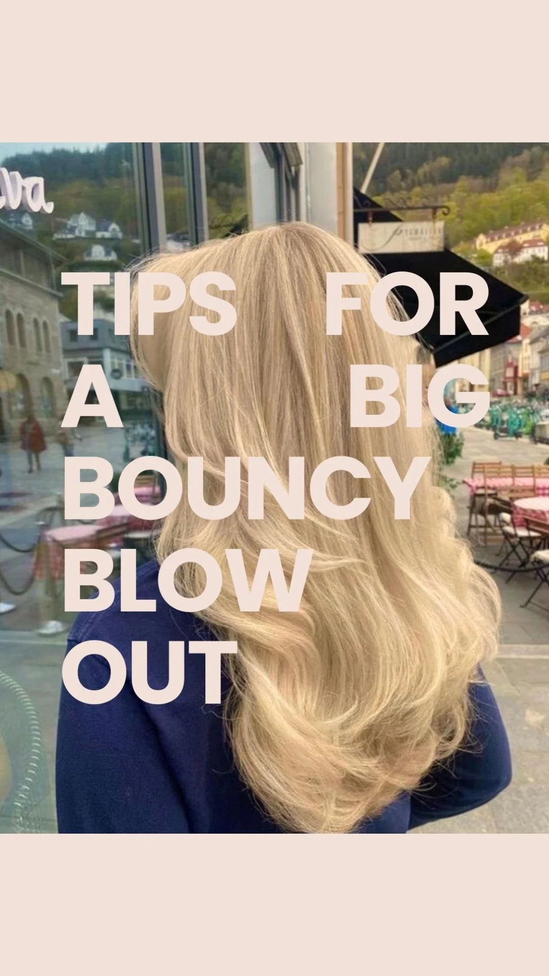
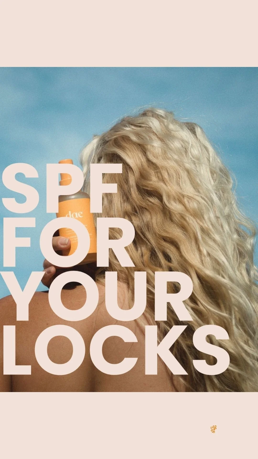
Content-First: I designed the Instagram layout to reflect real-world salon needs — hair tips, product features, client photos, and booking prompts — all wrapped in a cohesive and scroll-stopping aesthetic.
-
The final concept is a brand that looks good and knows it. The content feels cohesive across touchpoints, from branded cups to booking reminders. While this was a mock project, it showcases my ability to blend brand identity with social strategy, creating a client experience that’s both visually magnetic and practically thoughtful — perfect for modern beauty brands looking to stand out in a saturated space.
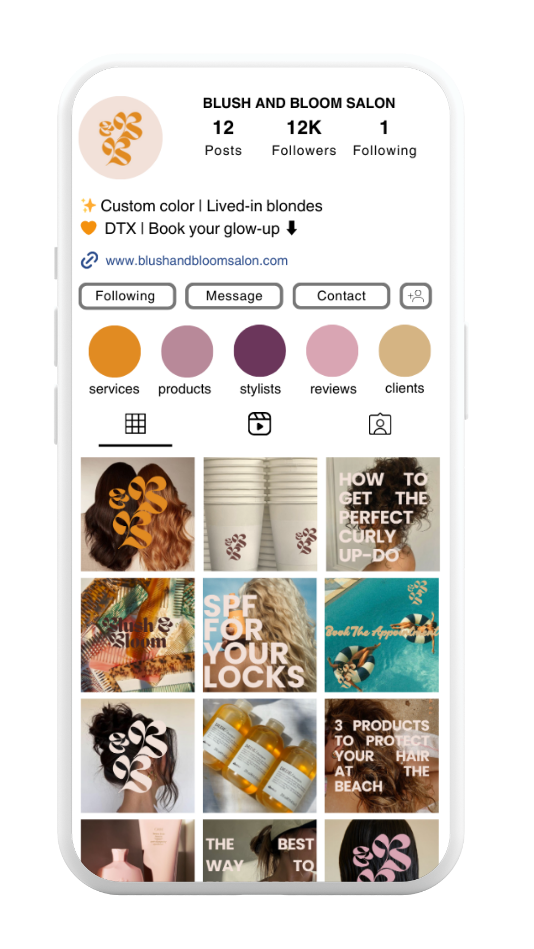

I paired bold serif typography with soft floral-inspired elements to strike a balance between editorial and approachable. The color palette leans into retro-modern tones — blush, terracotta, marigold, and mauve — giving the brand a nostalgic yet fresh feel.


The goal was to create a visual world that feels welcoming, a little cheeky, and totally scroll-worthy — a place where beauty meets personality, and every detail (even the coffee cups) adds to the experience.